This is the 40th week of the Art With Heart Colour Creation Showcase. Every week for the last 40 weeks we have been featuring one of Stampin' Up!s beautiful colours in alphabetical order. This we are featuring Real Red. Real Red is a true, rich red that has been in our range for as long as I have been with Stampin' Up!
I have made two cards this week as I wanted to show you the versatility of this stunning colour.
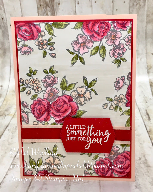
The first colour scheme I'm using is a feminine combination of Real Red with Petal Pink and Flirty Flamingo.
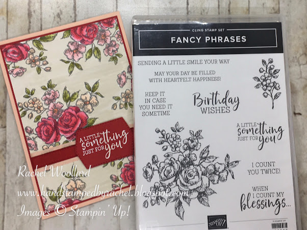
I used the Fancy Phrases stamp set to make this delicate floral card. I stamped the main image in Basic Gray for a more subtle effect.
I coloured the flowers and the background with Blends Markers. The colours I used are listed below.
The mat I have used is of course Real Red and the card base is Petal Pink. The two ribbons across the card are the same colours.
The greeting also comes from the Fancy Phrases stamp set. I have heat embossed it in white on Real Red card stock. I cut the greeting with one of the Tasteful Labels Dies.
I even found time this week to stamp and colour the inside of my card. I don't do this often enough, but it really finishes off the cards beautifully.
For the second card I chose a masculine colour scheme of Real Red, Misty Moonlight and Rich Razzleberry. The stamp set I used is Moving Along, which can be found in the 2020-21 Annual Catalogue.
I stamped lots of the cars in Memento Black ink. Then I dug out my Stamparatus and stamped some cars in reverse so that I could have cars driving in both directions. I used 13 cars in total. I coloured the cars in a mixture of Real Red, Misty Moonlight and Rich Razzleberry.
Once they were coloured I fussy cut all of the cars. I arranged the cars on the Basic Black background so that the colours were fairly evenly spread.
The greeting on this card is from the You Are Amazing stamp set. I stamped the speech bubble in Real Red then heat embossed the greeting in white embossing powder. I then fussy cut the speech bubble and attached it with Dimensionals.

I attached some of the cars with glue and a few with Dimensionals to add a bit of height to the card.
Again I had time to stamp the inside of the card. I stamped a row of cars along the bottom of the inside and coloured them with Blends Markers.
The mat is Misty Moonlight and the card base is Real Red. I used a thin strip of Rich Razzleberry card stock along the bottom of the background piece.
I hope I've inspired you to create some projects with beautiful Real Red. For more Real Red inspiration head to Cathy's blog for a complete list of tonight's participants.
Thanks for visiting,
Happy stamping,


Wow - what great cards, Rachel! I love the vintage look of your first card, with those lovely old-fashioned roses, and the background coloured in Crumb Cake. Your second card is a great, playful, creative work of art! What fun.
ReplyDeleteRachel your first card is beautifully coloured to give that vintage feel and what a fun second card! Love the cars and the colours you have used too!
ReplyDeleteLove the flowers, and your colour palette. Actually, the choice of colours for both cards is really "out there".The big greeting is perfect with the cars too.
ReplyDeleteYou certainly have inspired me Rachel. Both your cards are gorgeous. I love the soft feminine feel of your first card. As always you have coloured the flowers and background beautifully. Your car card is such fun. I love the way you have stamped cars traveling in both directions and your arrangement of colours with some cars adhered flat and others popped up on Dimensionals. Beautiful attention to detail. xxx
ReplyDeleteOh Rachel I love both your super feminine card and your playful and fun masculine card. Beautiful attention to detail in both cards and you’ve made me really want to order both these stamp sets now! Thank you for sharing your real red projects with us xx
ReplyDeleteI love the crumb cake background on your vintage rosy card, Rachel, it looks fabulous. Your patience to cut out all of those cars for your second card is amazing. They look awesome against the black background!
ReplyDeleteOh WOW Rachel, your cards are fabulous!!! I love them both. The beautifully coloured panel on your first card reminds me of a soft and pretty patchwork fabric, and it has such a lovely vintage look to it. Your second card is such a fun design and perfect for a young man or even a mature mans birthday.
ReplyDeleteYour first card reminds me of vintage wallpaper and the second card is fun and youthful but both are lovely.
ReplyDelete